Picture this: You’re gearing up for an executive presentation. The stakes are high — the fate of your new product or the acceptance of your customer proposal hangs in the balance. Of course, you’re armed with heaps of relevant data. But when should you rely on the hard facts and figures, and when do you call upon the power of storytelling to convey the message?
Image source: Wikimedia Commons (CC BY-SA 3.0)
Well, there’s no single answer but, when you combine the analytical power of numbers with the emotional resonance of words, you’ll create presentations that not only inform, but also inspire and leave a lasting impact.
When to prefer numbers?
When you need to provide clear-cut insights or concrete evidence or measurable results.
When your audience requires hard facts to make informed decisions about e.g. market sizing, RoI forecasts, product pricing, or test results.
When you want them to compare different options, quantitative data offer a fair and unbiased way to present and weigh the pros and cons of each.
When you want to demonstrate cause-effect relationships, numbers can illustrate the impact of certain decisions or the effectiveness of specific actions.
When to use words?
When you want to connect with your audience, communicate messages effectively, make your presentation memorable, and inspire action, storytelling is a powerful and timeless practice.
When you need to create understanding beyond rational thought, the story behind the numbers holds the key to humanizing data, fostering support, and unlocking deeper insights.
When you opt for anecdotes, problem-solution stories, or firsthand experiences to help you grab attention, spark interest, and better convey your message or value proposition.
In conclusion, numbers and words are not adversaries but allies in the quest for effective communication. By understanding when to leverage quantitative data for clarity and precision and how to embrace engaging narratives for depth and connection, you can create impactful presentations that resonate even with the most demanding audience.
Over the past decades I have attended and presented at many business meetings and public events. I’ve seen many good speakers, lots of mediocre ones, and (unfortunately) even more bad presenters. All people make mistakes, and sometimes we use words or say things that we don’t intend to. In most cases this is really no problem. Just remember Dale Carnegie’s observation – I’ve already quoted it a few times on this site – that there are always three speeches for every talk you delivered: the one you practiced, the one you gave, and the one you wish you gave.
But there are some phrases that sound wrong and unprofessional, each time a speaker articulates them. Phrases that can easily be avoided when you pay attention and anticipate, and if you invest that little extra time in preparing and rehearsing your presentation.
There are already a number of such lists circulating on the web, but below is my personal top 10 of speaker phrases that (in my humble opinion) never should be used.
1. “This presentation is about…”
You may always assume that the people in the room are familiar with the agenda of the meeting or the event. Even worse, simultaneously with pronouncing this infamous phrase, you’re most probably putting up a title slide that says exactly the same thing.
Most people in your audience will decide within the first seconds of a presentation whether a speaker is worth listening to. So, you must take this opportunity to grab their attention by intriguing, surprising or provoking them – instead of telling them something they already know.
2. “I’m not really familiar with this subject.”
This phrase is often followed by something like “but I’m replacing a colleague” or “but the organizers asked me to present this topic”. Well, there are no “but”s and no excuses for not being prepared. Preparation and rehearsal are key ingredients of any successful presentation. And, obviously, you should never talk about things you don’t really know about. This will only hurt your reputation, deny your ‘right to speak’, and prevent you from being invited as a presenter at future events.
3. “I didn’t have much time to prepare.”
I repeat: there is no excuse for not being prepared. And admitting this publicly only makes it worse for you.
4. “Can people in the back of the room read my slides?”
Unless you’re presenting to a group of visually handicapped people, there should be no reason to ask such a question. If you don’t overload your visuals with walls of text, endless bullet lists, or tiny fonts, even the back-row seaters will be able to enjoy your slides. Use font sizes 28–36 for titles, and don’t go below 20 points for the body text.
5. “On this slide, you can see…” or “The next slide shows…”
If you have used a font size large enough, people can – and will – read what’s on your slide. These meaningless intro sentences are a waste of time, and a lost opportunity to say something more interesting to catch (or renew) the attention of the audience.
6. “I know this is a complex diagram, but…”
Confucius knew: “Life is really simple, but we insist on making it complicated.” Most of the (sometimes complex) topics you present can probably be explained in a plain and simple way that all people understand.
Simplicity always works. There’s no need to overload your visuals with lots of boxes, arrows and clouds. You’ll spend too much effort creating them and too much time explaining them. Your audience will also spend too much energy to understand them – most often, the accompanying text on the slides will be too small to read by these people in the back of the room anyway. And, oh yes, also refrain from using acronyms, difficult words, expert jargon, and long sentences.
7. “As all of you will know…”
Don’t overestimate your audience. Never assume that everyone in the room is as bright as (you may think) you are. Even if a few experts fully understand the technical details on your slides, most of your listeners may not. Remember that very often it’s not the engineer, but rather his or her manager that attends a conference. And that it’s not always the person that ask many ‘interesting’ questions who’s taking the (business) decisions at the end of the day.
8. “Does that make sense?”
Although these words are commonly used by speakers to check if their audience understands or agrees with what they’ve just said, this phrase may also show a lack of self-confidence and even undermine your authority. It may suggest that you have doubts about the credibility of your story, or about your listeners’ capability to understand your content.
Note that this applies mainly to large and very large audiences. If there are a manageable amount of people in the room and you’ve done your homework, then you may build in more personal interaction and ask them for their opinion.
In all cases, however, you may try to read the audience instead. If you’re telling strange, stupid, or too difficult things, you will certainly get it from their body language. And in case you still want to do the “does that make sense?” test, then save the question for launching the Q&A at the end of your talk.
9. “I’m running out of time, so I’m going to skip the next slides.”
Let me believe that all the visuals you prepare are made to be presented. So, running out of time either means that you’re talking too much or too slow, or that your presentation deck has too many slides. A simple root cause analysis will tell you that in both cases something is wrong with your preparation and/or your rehearsal.
It’s actually quite easy to calculate the number of slides you need to prepare and want to present. You could simply apply Guy Kawasaki’s 10/20/30 rule, which says that a good presentation should have ten slides, last no more than twenty minutes, and contain no font smaller than thirty points (which is even larger than the 20 points I recommended above). Or – if the time slot that has been reserved for you happens to be longer or shorter than these 20 minutes – deduct 1/5th from your speaking time for Q&A, and divide the remaining minutes by 2 and by 3. The results of this simple calculation will give you an upper and lower limit for the number of visuals you can comfortably run through.
10. “That’s all I have to say. Thank you for listening.”
Never end your presentation with a dry “thank you for listening.” Finish your performance on stage in a memorable way and dismiss your audience with clear directions. Tell them what you want them to remember (summarize your main ideas and key points), what they need to do (give them some homework, or invite them to visit your webpage or read a handout), and how they can get there (by engaging in a next step with you or with your company – don’t forget to put your contact details on the closing slide!)
That’s all I have to write today. Thank you for reading ;-)
This is a compilation post that brings together my views on closely related topics, collating articles that I published earlier on this blog. It doesn’t contain new content, although part of it may have been slightly reworked. Knowing that the whole is often greater than the sum of its parts, I hope this update provides you with a bigger picture, a more complete list of good practices, or a better grounded opinion.
During the first weeks of their education, masses of freshman marketing students still get confronted with Jerome McCarthy’s 4P model. A tool created more than 50 years ago, in an age where customers were labeled “buyer” or “consumer”. And though the 4 P’s still may provide a fair means for defining a traditional marketing mix, I dispute that “putting the right product in the right place, at the right price, at the right time” is the most important course that 21st century students should get on the menu.
In the era of content, communication, conversation and customer experience (coincidently all starting with a C,) a marketer’s capability to create a decent message house, translate it into a captivating story, and use it to engage with a specific audience is probably more essential than mastering the 4 P’s.
So it was no surprise to me that the French ManpowerGroup identified the storyteller as one of the emerging job profiles for the future:
“a craftsman of engagement, the storyteller gives meaning to the company’s engagement and communicates with internal and external stakeholders through dialog and social media.”
Being able to create and deliver a compelling business presentation is certainly one of the basic competencies a storyteller needs. As Richard Branson once said in an Entrepreneur magazine Q&A:
“Good speakers aren’t just talented or lucky – they work hard.”
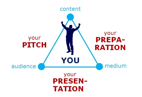
This is why I am dedicating this post to mastering the 3 P’s of presenting: Pitch, Preparation and Presentation.
The setting is simple: when you want to deliver specific content to a specific audience via a specific medium, you will need to connect the corner points of the triangle in the picture above.
First of all you will need to define your Pitch. The message(s) you want your audience to remember. How you will grab their attention and capture their interest. The story you want to tell them. This is where techniques like power mapping, message house building, and storyboarding will come in.
Take ample time for your Preparation. Choose the most effective medium (e.g. a PowerPoint show, Prezi, naked speech, video testimonials, …) for getting your story across and adapt your content to it. This is where your right brain hemisphere comes to the fore. When creativity, design and empathy turn out to be your most valuable attributes.
And finally, the moment will come when you are scheduled to face your audience and deliver your Presentation. Be prepared. Use all possible means of visual, verbal and non-verbal communication to persuade your listeners with your value proposition and to call them to action.
The attentive reader may have noticed that there’s something more in the center of the picture: YOU. Because, as KPCB’s Bing Gordon rightly observes,
“The first and most important element of your presentation is not a slide: it’s you.”
In the next 3 chapters, I will further elaborate on the 3 P’s and give some tips, tricks and tools for better pitching, preparing and presenting your content.
The first P: your Pitch
“Great stories succeed because they are able to capture the imagination of large or important audiences.” ― Seth Godin
Some readers may know pitching as what advertising agencies do to promote their ideas to a potential customer. And that’s indeed what it’s all about: defining your value proposition, translating it into a few clear messages, and deciding on how you’re going to communicate them to your customers (or any other audience.)
Finding the right pitch often boils down to pinpointing a sticky story to tell. With the right mix of ethos, pathos and logos you can appeal to the hearts and the minds of those listening to you.
Do you remember the 7 C’s of a good story? Compelling, credible, concrete, clear, consistent, customized and conversational. If you remember these seven adjectives, you’re already one step closer to a great pitch.
When defining your value proposition, never forget that value is in the perception
of the beholder. Adapt your pitch to address the WIIFM (What’s In It For Me) concern(s) of your audience. And give them something in return for listening to you.
As mentioned in the previous bullet, it’s extremely important that you have a good understanding of who will be in the room. Doing some upfront research and power mapping will help you to tailor your pitch and (later) customize your presentation to their specific knowledge, needs and expectations.
Building a message house is a great and simple means for defining, simplifying and structuring your messages, and to make sure your audience will remember them.
You could also consider creating a mind map and/or drawing a story board. These tools will help you to sort out your thoughts and put your ideas in a sequence that easily translates into a presentation.
A good way to validate your pitch is putting it to the elevator test. Can you ‘sell’ your message(s) in 30 seconds? Can you summarize your story on the back of a napkin? Can it be understood by your mother in law?
Once your pitch is completed, you’re all set to start preparing your presentation. Don’t forget that HOW you tell things may be as important as (or sometimes even more important than) WHAT you actually tell.
The second P: your Preparation
“World class presentations require time and focus” ― Nancy Duarte
Rome wasn’t built in one day. Neither will you be able to create a good presentation in a few hours. Crafting a presentation ― yes, even a business or technical one ― is a creative process. A process that takes more than a PC with PowerPoint (or Keynote, or Prezi, or …) installed on it.
As I wrote in my previous post, it all starts with finding your pitch: thinking about the story you want to tell, the messages you want to convey, and the results you want to obtain. So, don’t start creating a single slide before you have figured out WHAT you want to tell to WHOM, and HOW you’re are actually going to deliver it. Only then comes the ‘packaging’ of your content.
Always start with the end in mind. Take a blank sheet of paper and write down (no more than) three results you want to obtain from your presentation. What impressions do you want the people in the room to take home? What do you want them to remember about your product or service? What action do you want them to take after the meeting?
Then inventorize your assets: what facts and figures, anecdotes, trivia, case studies, experience, demos or prototypes, etc. do you have on hand that may help you achieve these objectives?
Based upon the outcome of the questions above, you may select the most suitable medium for delivering your content, e.g. a traditional slide presentation, a naked speech, maybe supported by video testimonials or — why not — a live demonstration. Note that your choice may also be influenced by the size and composition of your audience, the layout of the room, or the technical facilities you have on hand.
Make sure your talk has a begin, a middle and an end. Structure it the AIDA way. As the first seconds of your performance are crucial for grabbing your audience’s attention, choose a catchy title and a powerful opening slide.
Think visual. Use images to communicate, not decorate. Translate concepts to visual metaphors. Look for compelling ways to conceptualize facts, processes and data. You won’t need artistic drawing skills; a bit of analytical sense and a good portion of creativity will certainly do.
Analyze. Surprise. Focus. Simplify. Cut the crap and don’t feed the chameleons. Keep your presentation short and sweet. And when you prepare slides, keep them clear, clean and consistent.
Practice makes perfect. Rehearse your presentation as often as needed. In front of your mirror, your family or your colleagues. Or use a video recorder to tape your performance.
But most of all, reserve ample time for your preparation. The time you invest in realizing, refining and rehearsing your presentation should be proportional to the importance of your talk, and reverse proportional to the time you will be given to present.
The third P: your Presentation
“There are always three speeches, for every one you actually gave. The one you practiced, the one you gave, and the one you wish you gave.” ― Dale Carnegie
I am aware that many of you may suffer from glossophobia, or fear of public speaking. But honestly, if you have invested enough time in defining your pitch and preparing your presentation there’s really not that much left to worry about.
Make sure to avoid unpleasant surprises. Arrive at the venue well in time, get familiar with the room in which you will present, and check the A/V equipment before your start. And when you’re planning a demo, dry-run it a few minutes ― not a few hours! ― in advance.
Go on stage with a positive attitude. Don’t get paralyzed by stage fright. You know that you can do it! Take a deep breath before you start and give the audience what they came for.
Start with a short silence. Then grab your audience’s attention from the first second onward. Surprise, intrigue or provoke them with an opening statement or poll.
As I have explained in many of my older blog posts, when you give a presentation, you need to get your audience engaged. Appeal to their emotions, by telling a personal story. A good practice is to try to make eye contact with a few individuals in the audience and monitor their body language.
But, watch your own body language and nonverbal communication too. Your tone of voice, volume of speech, as well as your facial expression, stance and gestures should add to or complement your verbal message.
Speak in short sentences and pause often. Pause right before a key point to create a sense of anticipation. Pause right after a key point to allow it to sink in. And, most importantly, don’t forget to breathe.
Take care of your speaking time. Ask a time keeper in the audience to give you a five or ten minute warning. If you feel you’re going to run over time, adapt your story and/or your pace, or consider skipping details and less meaningful slides.
Concentrate on the message — not the medium. Only present your own pitch and show the slides you prepared yourself. Don’t let the visuals dominate your talk. Never read your slides aloud: most people in the room already know how to read!
Be aware where you stand, don’t obscure the screen, and don’t turn your back to the audience. When you like to move around on stage, make sure you use a remote control device (that’s why I always carry a clicker on me, along with a spare battery ― prevention is better than cure.)
End your presentation in a powerful way. Your closing is your chance to leave a final impression on the audience. Don’t lose energy. Don’t change style. Don’t stop cold. Summarize your main ideas and key points. And call the people in the room to action.
The 3 P’s. Do you still know what they stand for? If you want to be a professional public presenter, then take control of your pitch, your preparation and your presentation.
I have also created an infographic that summarizes this post. You may download the file by clicking on the image below (or hitting the download tab on top of this page).
This is a compilation post that brings together my views on closely related topics, collating articles that I published earlier on this blog. It doesn’t contain new content, although part of it may have been slightly reworked. Knowing that the whole is often greater than the sum of its parts, I hope this update provides you with a bigger picture, a more complete list of good practices, or a better grounded opinion.
“Designing a presentation without an audience in mind is like writing a love letter and addressing it ‘to whom it may concern.’” – Ken Haemer, former AT&T presentation research manager
Did you ever wonder why the people in the auditorium or meeting room came in to listen to your presentation?
In fact, you should ask yourself that simple question each time again. Because each audience –or even each single member of that audience– may have different and personal reasons for attending:
“Learn something.” As you, the guy in the front, are assumed to be an expert in your domain.
“Get the necessary foundation for making a business decision.”
“Obtain confirmation or recognition from managers or peers in the same room.”
“Meet with other people in the industry.” At public conferences and seminars.
“Be entertained – and enjoy a networking cocktail at the end of the day.” Also often the case at public events.
None of the above. Some people may just “feel obliged to attend.”
As such, it’s extremely important that you have a good knowledge of who is your audience to tailor your presentation to their specific knowledge, needs and expectations.
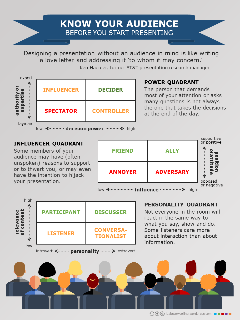
In the following sections, I will introduce 3 tools, the Power Quadrant, the Influencer Quadrant and the Personality Quadrant, to help you better understand – and thus better address the people you’re dealing with.
The Power Quadrant
In many cases the persons that demand most of your attention or ask many questions are not the ones that are taking the (business) decisions at the end of the day. Power mapping techniques, like drawing a power quadrant, often lead you to a better identification and understanding of the key players in the room.
A power quadrant assesses the (e.g. technical or financial) authority or expertise of your listeners vs. the effective decision or execution power they have. A well prepared presenter knows to which category the people in front of him/her belong, and how to deal with the different roles they play.
Influencers are experts in an advisory role, but don’t have clear decision power. Provide them with the arguments to convince their managers. Go through the details and help them score.
In many cases,controllers have a final word. As they often don’t have the expertise to grasp all the details of your presentation, just make sure that you win their confidence, trust and support.
Deciders are the ones who have both the knowledge and the power to close the meeting with a clear “go” or “no go”. Give them all necessary elements for making a decision –here and now!
And finally, there are also non-contributingspectators. There is no need to pay special attention to them. Just help them make it through the day.
The Influencer Quadrant
Unfortunately, getting decisions made is not only about bringing the people with authority and power on the same page. Some of the members of your audience may have (often unspoken) reasons to support or to thwart you, or may even have the intention to hijack your presentation.
This is where crafting an influencer quadrant often turns out useful.
It allows you to proactively identify potential advocates and opponents in the audience, and adapt your attitude, behavior and content accordingly.
Friends: in an ideal world (which unfortunately does not exist) the room in front of you is filled only with men and women that like or respect you, your products or your company. Give them the opportunity to express their opinion and contribute to a constructive conversation.
There may be adversariespresent too. People who had a bad experience with your company or your products or have been charmed by a competitor. Always be respectful and try to convince them with arguments –hoping they will change their mind.
Having alliesin the audience is even better than having friends. As they combine a positive stance with influencing or decision power, get them involved into the discussion and let them help to prevail upon the others.
Unfortunately, sometimes there is also this one annoyerin the room whose intention is to spoil the meeting or hijack your presentation. Even if he is nothing but a pain in the… (fill in your favorite three or four-letter word): stay polite. Block him off when you can, but make sure that you don’t lose the support of the other people.
As a conclusion, it’s always good to think about which and why people in the room may be prejudiced, either in a positive or negative way. So make sure you know how to deal with friends and foes, and deal with them appropriately.
The Personality Quadrant
There are many typologies and taxonomies that may help us understand why certain people respond to specific situations the way they do. The dichotomy between introversion and extraversion is one of them. If you to want build a good rapport with your audience and get your message across, you need to understand your speaking/listening partners’ personality, anticipate that they may react differently to what you say, show and do, and adapt your interaction style to their needs.
In the previous sections, I introduced a power quadrant and an influencer quadrant as tools to characterize your audience, and to adapt your content and presentation style to their anticipated behavior. Recently a came across a document that introduces a 3rd –complementary– matrix that takes your listeners’ introversion and extraversion into account.
Introverts care more about information than about interaction. They value exact data, facts and figures to learn, apply and reuse. As they need some time to think before formulating a response, don’t be surprised if they appreciate the handouts of your presentation more than your narrative. You may even consider to provide them upfront with a copy of your slides, so they have ample opportunity to prepare, annotate and digest.
Listeners: When what’s being presented is either uninteresting or irrelevant for them, introverts may just limit their participation to passive listening. So, make sure you supply them with ample (oral or written) information to take home and share with their management and colleagues.
Participators:Even when the content is relevant, don’t expect introverted people to be enthusiastic about what you say or to explicitly show their appreciation. Be ready to answer many questions about details – if not during the public presentation itself, probably in a tête-a-tête afterward.
Extraverts tend to think while they speak; they appreciate a good story (which they can retell) and are in for a good conversation. Surprise them, challenge them and acknowledge their thinking with your words and images. Expect them to interrupt your speech from time to time, and prepare for an inspiring discussion after your presentation.
Discussers: As extroverts tap their energy from interaction with other people, they may (intentionally or unintentionally) hijack your presentation by starting a discussion – with the rest of your audience – about their own vision, project or experience. It’s good to have them in the room, but make sure you stay in control of your speaking slot.
Conversators: A problem with many extroverted people is that they like to talk about (almost) everything, just for sociability. Don’t allow them to deviate you from your topic – and end up in a “rest room conversation”.
Of course, Introversion vs. Extraversion is not the only dimension of human personality. There are other models, such as the Myers-Briggs Type Indicator or MBTI, that introduce (and combine) other typologies, e.g.:
How does someone take in information (Sensing vs. iNtuition)
How does someone make decisions (Thinking vs. Feeling)
How does someone orient himself/herself to the external world (Judging vs. Perceiving)
By the way, my MBTI personality is E-N-T-P. I invite the readers of this blog to figure out what this means, and how you’d get me warm for your presentation.
I have also created an infographic that summarizes this post. You may download the file by clicking on the image below (or hitting the download tab on top of this page).
This is a compilation post that brings together my views on closely related topics, collating articles that I published earlier on this blog. It doesn’t contain new content, although part of it may have been slightly reworked. Knowing that the whole is often greater than the sum of its parts, I hope this update provides you with a bigger picture, a more complete list of good practices, or a better grounded opinion.
“Don’ go burdenin’ other people with your sins. That ain’t decent.” – John Steinbeck in The Grapes of Wrath
One of my favorite publications about presentation skills is Scott Berkun’s “Confessions of a Public Speaker.” In his book, Scott tells about his life as a professional presenter and testifies about embarrassments and triumphs he has experienced when speaking to crowds of all sizes.
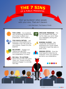
Over the past two decades I have crafted and delivered many public and private presentations. In this article, I’d like to share some best and worst practices with you. Below is my list of the seven cardinal sins that every presenter should try to avoid. I confess that I have repeatedly committed all of them. But no speaker is perfect. Let him or her who is without sin cast the first stone…
1st sin: Too long
The former Cuban leader Fidel Castro, who is famous for delivering long-winded speeches, addressed the 1986 communist party congress in Havana for 7 hours and 10 minutes.
And still, El Comandante’s listenership may have called itself lucky, because PowerPoint was only launched officially in May 1990. By extrapolating the slideware generating habits of some of my colleagues at work, I estimate that El Caballo’s oration might have been good for, say, 750 slides. As some sources claim that you need at least one hour of preparation time for each minute of presentation (which IMHO sounds a bit overdone,) this would have taken El Jefe Maximo a mere 430 hours (or almost 54 working days) of crafting. Maybe in Cuba, time isn’t (or wasn’t) money at all?
Your audience may be spending valuable time and money to attend a presentation too. Don’t waste it. No single speech should take longer than necessary.
There’s actually a very simple prescription for that, formulated by author and Canva evangelist Guy Kawasaki who called it the “The 10/20/30 Rule of PowerPoint”, which says that a PowerPoint presentation should have ten slides, last no more than twenty minutes, and contain no font smaller than thirty
And if the time slot that has been reserved for you happens to be longer or shorter than these mere 20 minutes, here’s another easy-to-use formula for calculating the number of visuals you can afford to put on:
Always begin by deducting 1/5th from your speaking time, and reserve it for interruptions, questions and answers. Then — assuming that the average presenter spends between 2 and 3 minutes per slide — divide the remaining minutes by 2 and by 3. The results of this simple calculation will give you an upper and lower limit for the number of visuals you can comfortably run through.
2nd sin: Too much detail
Some time ago, I went shopping for a new wristwatch. Although I am working in the digital industry, for this kind of stuff I’m still pretty much into analog, and I don’t have the intention to buy a smartwatch anytime soon – at least not as long as the device’s battery life is comparable to my smartphone’s.
Trying to convince me about the superiority of his merchandise, the jeweler tried to explain me that the oscillator in a quartz clock functions as a small tuning fork, and is laser-trimmed to vibrate at 32,768 Hz. Huh? Didn’t I enter his boutique for simply buying a new timepiece? Why did I need to know about all the internal mechanism of a watch? And was this guy really that smart that he knew all these nitty-gritty detail, or did he just try to impress, persuade or mislead me by dropping numbers and citing trivia?
Here’s some advice for the jeweler. As well as for every sales person, or anyone delivering a product presentation:
Not every person is interested in the nitty-gritty of your product. Keep your presentation short, sweet and to the point. Limit your content to the essential.
Even if you are the expert in the room, you don’t have to overload your audience with all your explicit knowledge. Don’t spread the jam by giving superfluous details!
Try to stay within your comfort zone. Don’t introduce topics that you hardly know anything about. If your public has a bad day, they might start asking you more difficult questions – for which you may not have a good answer ready.
Don’t present eeeverything you know about a single topic. As a rule of thumb, make sure that for every minute you talk, you have about three minutes of ‘backup material’ (more information, related topics, anecdotes, …) available.
Always be prepared for detailed questions and discussions. And if you don’t have the right answer on hand, don’t be afraid to say “I don’t know” or “let me look this up and get back to you.”
Know your audience. Be able to change your style, your presentation flow and your level of detail. With the right tone of voice and a good story, you will certainly convince them that you’re a person of interest, that you are an authority on the topic you present, and that you have the “right to speak” (or to sell quartz wristwatches).
3rd sin: No story
Recently, I attended a presentation given by a famous researcher. Although his research topic was very interesting and his slides were loaded with stunning facts and figures, I noticed many people in the auditorium playing with their phones and tablets. I’m also almost sure that many of them (including me) left the room with a “so what?” feeling.
As a computer scientist who started his career in R&I, I know that it’s not obvious for an engineer to present a complex research topic, and to cover the necessary technical details while keeping the undivided attention of an (often mixed) audience. This is why I have embraced (and started blogging about) the practice of storytelling.
Telling stories is a way to create a tension with the audience, get them engaged beyond the rational and make them connect emotionally and/or ethically. Stories produce mental images. They are a means to stimulate higher level thinking and let the audience come to a conclusion on their own. A good story enables individuals to make a leap in understanding complex products, services and solutions.
Already in the 4th century B.C., the Greek philosopher Aristotle formulated his theory on the three persuasive appeals: ethos, pathos and logos.
Since then, Aristotle’s rhetoric has become one of the foundations of public speaking and, as such, an equilibrated mix of the 3 ingredients should be considered a prerequisite for any well told story.
Ethos means ethical appeal. We tend to believe people whom we respect. We trust in products with a good reputation. We go to places that were recommended on Yelp or Tripadvisor…
Pathos translates to emotion. We all like stories about the good vs. the bad. We prefer presenters that speak passionate about their topic. We (too) often make decisions motivated by love, admiration, fear or disgust.
Logos stands for reasoning and argumentation. We believe in what we can see and what we can touch. We want statements supported by facts and figures. If not, we keep asking for the Why, the What and the How.
If you think about it, ethos, pathos and logos are present in almost every area of our daily lives. And more than we realize, they determine how we (and our audience) experience situations, interact with people and make decisions. And, as for so many other things in life, the whole of Aristotle’s rhetoric is greater than the sum of its three parts: it’s neither about ethos OR pathos OR logos, but all about ethos AND pathos AND logos.
4th sin: No call to action
In web design, a banner, button, graphic or text often prompts a user to enter a conversion funnel. By clicking on it, he/she confirms his/her interest in the content and (on an e-commerce site) may enter into a next step towards buying a product or service.
As the primary purpose of most business presentations is to move the audience to action, you should make sure that you have similar mechanisms included in your talk.
So, never end your presentation with just a “thank you for your attention” or a Looney Tunes inspired “that’s all folks!” Dismiss all these men and women with clear directions. Tell them what you want them to remember, what they need to do, and how they can get there.
Leave ample time for questions. As a rule of thumb you should reserve around 20% of your time budget for Q&A and discussion. Make sure you are prepared for provocative or even weird questions from the room, and remember that a poor Q&A at the end may ruin the whole of your performance.
Summarize your main ideas and key points. Make sure you end in agreement with (the majority of) the audience and that they are ready for taking a next step with you.
Invite your listeners to engage in a next step. Always end your speech with a call to action or a call to application. Give them a bit of homework (like visiting your webpage, or reading a handout), make them agree on having a follow-up meeting (don’t forget to supply them with your contact details), or simply encourage them to use the products or apply the material you presented (such as the tips I am sharing in this post.)
Finish your presentation in a memorable way. Take the occasion to leave a final impression on your audience. Don’t stop cold, but try to surprise them one last time before you quit the stage.
5th sin: Unclear message
Even worse than a bad closing is when you let your audience go home with a “what has this guy been talking about for more than an hour” feeling.
The way you present may either help or hurt to make your point. Make your message(s) strong and memorable, and deliver it (them) in a catchy and captivating way.
In his MacWorld 2008 keynote, the late Steve Jobs presented the world’s thinnest notebook, the MacBook Air. The Apple CEO introduced the new product with a photo of an envelope, told the audience that the new device was “so thin that it even fits inside one of those envelopes you see floating around the office,” and then pulled up and opened a real envelope that contained the new, ultra-thin laptop computer (watch the video on YouTube.) Sometimes there’s a thin line between a good and a great presenter. Steve Jobs has always been on the right side of it.
Finding the right pitch for your presentation often boils down to pinpointing a sticky story to tell. With the right mix of ethos, pathos and logos you can appeal to the hearts and the minds of those listening to you.
A good story has to be compelling, credible, concrete, clear, consistent, customized and conversational. If you remember these seven C-words, you’re already one step closer to a great pitch.
When defining your value proposition, never forget that value is in the perception of the beholder. Adapt your pitch to address the WIIFM (What’s In It For Me) concern(s) of your audience. And give them something in return for listening to you.
Building a message house is a great and simple means for defining, simplifying and structuring your messages, and to make sure your audience will remember them. When properly constructed, it is almost straightforward to transform this message house into a skeleton for your presentation.
A good way to validate your pitch is putting it to the elevator test. Can you ‘sell’ your message(s) in 30 seconds? Can you summarize your story on the back of a napkin? Can it be understood by your mother in law?
Finally, as shown in the MacBook Air example above, a strong opening can make a real difference. Most people decide within the first few seconds of a presentation whether a speaker is worth listening to. So make sure to grab the audience’s attention by surprising, intriguing, or provoking them.
6th sin: Boring slides
It’s tempting to rely upon material that others have created before you. Nothing as easy as making a slide deck by cutting and pasting slides from existing PowerPoint into yours. But there’s a consequence: 99% of these cut‘n’paste slideshows look like chameleons, that change colors, fonts and layout with every slide transition.
Look and feel do matter! If you want your audience to perceive you as a professional, then never compromise on the layout of your slides!
Real estate: Don’t overdo. Beware of creating slideuments.Apply the same template to all slides.Use plenty of white space. Limit the amount of bulleted slides as well as bullets per page.
Colorsshould contrast with the background. Don’t put together too many colors on one screen. Avoid using red text on a white or black background.
Fontsmust be readable from the back of the room. Be consistent in style throughout the whole deck. Don’t mix too many typefaces. Avoid script fonts. Boldand italic are good to emphasize text, underline isn’t.
Images: use visuals that complement or accentuate your message instead of standard clipart or crapart, that adds no extra value (we all hate screen beans or know the man climbing a bar chart, don’t we?) Avoid mixing line art and photos.
Vocabulary: Consequently use the same terminology everywhere. Beware of acronyms and abbreviations. Don’t use jargon or slang.
So next time you need to build a business presentation, don’t feed the chameleons! Start well in advance and take your time to tune each slide. Don’t take existing material for granted. Be creative. Be consistent. Be professional.
7th sin: Wrong pitch
Even the most beautiful slides may be irrelevant to your listeners. It’s extremely important that you have a good understanding of who will be in the room. Doing some upfront research will certainly help you to tailor your pitch and (later) customize your presentation to your audience’s specific knowledge, beliefs, feelings, needs and expectations – and establish an emotional connection with them.
Make yourself familiar with Robert Cialdini’s principles of persuasion: reciprocity, liking, authority, social proof, commitment, and scarcity. These will help you to appear convincing, credible and trusty in front of your listeners.
Creating personas and asking questions about them like: “What is their role in the organization?”, “What does an average day in their job/life look like?”, “What do they value most?”, “How do they get motivated?”, and “What could be their most common objections to your product or service?” may be good means for tuning your content
I have also created an infographic that summarizes this post. You may download the file by clicking on the image below (or hitting the download tab on top of this page).
Storytelling is the interactive art of using words and actions to reveal the elements and images of a story while encouraging the listener’s imagination. — Definition by the National Storytelling Network
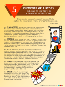
Most novelists and movie directors rely upon 5 key elements to ensure a consistent story, allow the action to develop and let the audience emotionally engage: character, setting, plot, theme, and style.
And, though “telling a story” is often associated with delivering fictive content, the same components can be explored by business presenters too.
The character is the individual (or several of them) that the story is about. The answer to the “who?” question. Many narratives introduce protagonists and antagonists — respectively the main characters of the story and their opposites. Note that a protagonist does not necessarily represents the “good guy”, though it’s always the one with whom the reader can identify himself or herself.
Depending on the topic of your business presentation, the protagonist may be you, your company or even your product, while the antagonist may e.g. be a competitor, a demanding customer or even an unfavorable market condition.
The setting is the “where? and when?” of a story. It is the time and place during which a story takes place. This can be in the past, the present or the future, and in an imaginary or a real-life location.
Introducing a setting with which your business partners or customers are familiar, e.g. a specific technology configuration or a market segment, can help them to better visualize the story and feel connected to the plot. As such, customer testimonials and case studies may be good means for setting the scene for your presentation.
The plot defines the structure of a book, movie or talk. The sequence of events and (inter)actions that make up your storyline. Many good plots are centered around a conflict or a problem (the “what?”), the ways in which the characters attempt to resolve the problem (the “how?”), the actual implementation of the solution (a.k.a. the climax), and what happens with them when the conflict is no longer existing (“they all lived happily ever after”.)
As mentioned above, characters do not necessarily have to be human. So, explaining how your products or services have been applied to solve a specific customer problem may prove an excellent plot for a business presentation.
The theme is the main idea, the central message, the answer to the “why?” question(s). It’s what the writer, the director, or the presenter wants his audience to learn from the story.
It’s the umbrella statement of the message house you’ve prepared, that will translate into the conclusion and/or the call for action at the end of your discourse.
And finally, there’s a style element in each presentation you deliver. “How?” do you want to get your message through? How will you tap your audience’s imagination? What will be the tone of your words? What mood or atmosphere do you want to create with them? Is the evidence you provide factual or anecdotal?
A few related articles (though most posts on this blog touch upon this topic):
I have also created an infographic that summarizes this post. You may download the file by clicking on the image below (or hitting the download tab on top of this page).
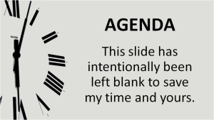
We have a new company PowerPoint template. And when I opened the file, the first slide that hit my eye – after the title page of course – was titled “Agenda.” Well, one thing I already know for sure: that will be the one I am going to kick out each time I start creating a new slide deck.
I always try to keep my presentations short and sweet. As such, I’m a big fan of Guy Kawasaki’s 10/20/30 rule – prepare 10 slides, to support a 20 minute speech, with 30 point font size text on it– and therefore I cannot afford to waste 5 minutes at the beginning of my speaking slot to explain the audience what I am going to tell them during the following 15 minutes.
You better start your presentation with a strong statement, and try to intrigue surprise or provoke the people in the room instead of boring them with a “this is what I will have on the next slides” intro.
And if you have 5 minutes extra to spend, use them wisely at the end of your talk for summarizing your key messages and calling your listeners to action.
Some time ago, I went shopping for a new wristwatch. Although I am working in the digital industry, for this kind of stuff I’m still pretty much into analog, and I don’t have the intention to buy a smartwatch anytime soon – at least not as long as the device’s battery life is comparable to my smartphone’s.
Trying to convince me about the superiority of his merchandise, the jeweler tried to explain me that the oscillator in a quartz clock functions as a small tuning fork, and is laser-trimmed to vibrate at 32,768 Hz. Huh? Didn’t I enter his boutique for simply buying a new timepiece? Why did I need to know about all the internal mechanism of a watch? And was this guy really that smart that he knew all these nitty-gritty detail, or did he just try to impress, persuade or mislead me by dropping numbers and citing trivia?
Actually, this incident reminded me of the so-called jam principle:
The less you have of something ― expertise, knowledge, culture, or just marmalade ― the more you are tempted to spread it out.
Here’s some advice for the jeweler. As well as for every sales person, or anyone delivering a product presentation:
Not every person is interested in the nitty-gritty of your product. Keep your presentation short, sweet and to the point. Limit your content to the essential.
Even if you are the expert in the room, you don’t have to overload your audience with all your explicit knowledge. Don’t pump up the jam with superfluous details!
Try to stay within your comfort zone. Don’t introduce topics that you hardly know anything about. If your public has a bad day, they might start asking you more difficult questions – for which you may not have a detailed answer ready.
Don’t present everything you know about a single topic. As a rule of thumb, make sure that for every minute you talk, you have about three minutes of ‘backup material’ (more information, related topics, anecdotes,) available.
Always be prepared for detailed questions and discussions. And if you don’t have the right answer on hand, don’t be afraid to say “I don’t know” or “let me look this up and get back to you.”
Know your audience. Be able to change your style, your presentation flow and your level of detail. With the right tone of voice and a good story, you will certainly convince them that you’re a person of interest, that you are an authority on the topic you present, and that you have the “right to speak” (or to sell quartz wristwatches).
Even if you’re not dealing in clocks (or marmalade), you may still read these other posts on my blog:
As my day job is in strategic marketing, I often have to deal with numeric data, such as market size, market shares, revenue forecasts, etc. That’s maybe the reason I stopped believing in naked figures. Particularly when presented in isolation, without any information about their source, logic or meaning.
Take this example. A few months ago I was preparing a presentation about disruptive market trends in telecom. While crafting a slide about the massive potential of the Internet of Things, I got confronted with growth forecasts ranging from “26 billion units by 2020” to “212 billion things in 2020.” Yes, that’s a difference of a factor of almost ten. One would expect a bit more alignment between respected industry analysts like Gartner and IDC. It was even impossible to tell which estimate was the most accurate one, because it wasn’t also very clear what “units” or “things” they actually counted…
Here’s my point: numbers are meaningless without context or without a good explanation. There’s a quote attributed to Winston Churchill, saying that:
“The only statistics you can trust are those you falsified yourself.”
Although sources claim that Sir Winston never made such statement at all – which means that you should be as cautious when citing quotes as when showing numbers – there’s certainly some truth in it:
Most presenters use figures either to prove their point or to persuade their audience (of a point they aren’t able to prove.) Both may of course be honorable causes, but still, as a member of the audience this often gives me an uncomfortable feeling of being manipulated.
Even when facts and figures are not intentionally misleading, they still may be massaged to invoke more (or less) emotion (see e.g. Garr Reynolds’ example about the usage or tables and charts in my previous post.) And of course, the same numbers can mean different things to different people.
You can prove anything you want with numbers, statistics and correlations. From a 2011 BusinessWeek article I learned that Facebook ignited the Greek debt crisis, and that Global Warming is caused by scientific research… If you (or the people listening to you) have no idea of what’s behind a correlation, you may claim any fact you like.
Another more recent case of such correlation equals causation thinking – also known as the cum hoc ergo propter hoc fallacy – is a Princeton study saying that Facebook would lose 80% of its users by 2017. The numbers generated a row between the Princeton University researchers and the Menlo Park social networking giant, as the latter on its turn “proved” that the renowned university would lose all of its students by 2021.
As a conclusion, if you want to include numbers, statistics and correlations in your presentation, use them scarcely, carefully and wisely. Always mention their source(s), present them with the necessary reservation, and in the right context.
For what it’s worth: last week, Google announced a new tool that should help data analysts distinguish cause from correlation, when e.g.measuring sales generated by a web banner, or estimating the impact of a new feature on app downloads.